Question 1.In what ways does your media product use, (develop or challenge) forms and conventions of real media products?
I have added screen grabs for a longer, clearer focus on the slides...


AUDIO

AUDIO
Question 2.
How does your media production represent particular social groups?

My media product represents particular social groups through the idols/ people in my designs. The double page spread article, represents Kelly Baker as a passionate, devoted fan, which therefore represents people of her social group positively towards music, and celebrities. My front cover design represents a young woman as a young artist trying to achieve her ambition as a singer. Therefore this shows people of her social group/other young artists trying to hit the spotlight, as committed, passionate, and independent. Therefore my media product represents the particular social groups as positive.
Here are some particular soicial groups/audience members that link with the ones I represent in my media production...
 A group of 17-19 year olds, all fans of music
in particular R&B soul.
 Supportive fan of Soul star Michael Buble.
 Young artist following the paths of the stars in the magazine industry.
What kind of media institution might distribute your media product and why?

There is a small variety of media institutions that might distribute my media product. The first is, 'IPC'. This is because IPC Media publishes a huge range of magazines across many different sectors. It covers music magazines, e.g 'NME', television, hair, living, gossip etc. Therefore already covering that many areas (including music) I believe IPC Media might distribute my media product.
 http://www.ipcmedia.com/
Another media institution that might distribute my media product is 'BAUER'. The Bauer Publishing Group is a worldwide media empire offering over 230 magazines in 15 countries. Bauer Media covers music magazines such as, 'Kerrang', 'Mojo', and 'Q'. These are 3 very popular music magazines, therefore i think that already covering these magazines and such a range over the world (15 countries) that BAUER Media might distribute my media product.
http://www.bauermedia.co.uk/Question 4.Who would be the audience of your media product?
usic fans (majority of Soul)
Age: 16-21
Gender: Mixed
Examples of my Audience members...

Name:Zach Holmes
Age:21
Hobbies:Singing, Playing tennis, endulging in a music magazine.
Favourite artist:Chris Daughtry

Name:Amy Griffiths
Age:17
Hobbies:Dancing, listening to music, watching films, singing.
Favourite artist:Beyonce
Studying:dance, art, music, media

Name:Shenna Hale
Age:19
Hobbies:Reading music magazines, singing, playing music, dancing.
Favourite artist:Michael Buble
Studdying:Music/Media

Name:Jack Clarke
Age:18
Hobbies:Singing swing music, helping out at gigs, performing for an audience
Favourite artist:Michael Buble
Studying:Physics, music, media, drama
Laura Smith

Laura is a big soul music fan. She lives for music and is the girl on the front cover of my magazine, trying to find fame in music. Soul songs are her passion. Laura is 19 years old, goes to Weatherhead High School, and loves endulging in soul/modern R&B music magazines. Therefore I think she would be the ideal audience member for my magazine.
Question 5.How did you attract/address your audience?
 Image of magazines in a standard corner shop, with mine included for indication of where it stands.
I attracted and addressed my audience, by using answers from my questionnaire that was filled in by my target audience. Therefore my designs and features follow some of the ideas preferred by my audience. I used a consistant stylish colour scheme, and a catchy slogan. I also included information and coverlines about famous soul artists/bands. My front cover stands out from the rest as i think the image and the colour scheme are very unique.
Question 6.What have you learnt about technologies from the process of constructing this product?
- I have learnt and used new tools from software such as Adobe Photoshop and Quark Express.
- I have discovered new ways to use mise-en-scene effectively so that the image reflects the subject/text.
- I have learnt how to use a still camera so that i capture everything in an image that i need to get the outcome i desire.


Question 7.
Looking back at your preliminary task, what do you feel you have learnt in the progression from it to the full product?


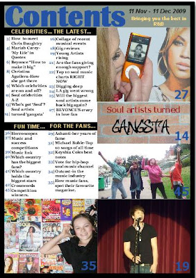
Looking at the comparison between the two designs, I believe I have taken on the roll of a magazine designer, whereby i am following and developing the codes and conventions of real media products. i have chose a more realistic colour scheme, and have put more thought and imagination into my images.


There is not much of a difference within the contents pages, however analysing the two designs, I understand that i have used a differnet set of technology through creating the music magazine, as I believe my music magazine appears more profesional than the school magazine. My design for the music magazine follows the codes and conventions much more than the school magazine contents page. the columns and images are more alligned and they all represent or relate to a piece of text.
Therefore looking back at my preliminary task, i feel that i have learnt how to develop the codes and conventions of real magazines, using more challenging software, and different skills from the school magazine to the music magazine. I have managed to go into depth of examining real magazines to help create my own, rather than just make up ideas on the spot.


